As I alluded to in Tuesday's entry, the Mountain West unveiled its new logo and re-branding efforts in a press conference this week. And like so many other big changes that have taken place across college sports in the last year, the reaction to it was visceral and almost immediate. Is this honestly how people perceive the logo? Or are they just acquiescing to the "everything sucks and you're stupid" culture the Internet perpetuates? Or is it something else?
I've already gone on record as saying I think the logo is fine -- it's not the best one out there, but I've certainly seen worse. The recent trend in branding athletic conferences has been to move beyond the "conference" label to something bigger and more abstract, and this new look for the Mountain West is no exception. With this new image and marketing effort, Craig Thompson wants to elevate the Mountain West name to become synonymous with the region whose name it bears, to help give it the same cache the SEC name carries in the south or the Big Ten name has in the upper Midwest.
No one should be surprised the logo got the kind of reception it did -- the anonymity and instant feedback the Internet now provides to people's thoughts has fostered entire generations who are absolutely certain they can instantly hate something even if they're not quite sure why. What I don't quite understand in this case, though, is the attachment people apparently had for the old Mountain West logo. The conference itself is very young -- not yet a teenager compared to its peers and even younger than Conference USA or the Big 12. Yet fans still went absolutely apeshit when this change was made public, like they had just returned to their new car and found it mounted on cinder blocks with its tires missing. Had they really grown that attached to something which had come into existence barely over a decade ago?
I'm fully aware that being a Nevada fan pretty much makes me an outsider to Mountain West history and lore up to August 18th of last year. But I still think this whole ruckus can be chalked up to good ol'-fashioned nostalgia -- that fond remembrance of things past which almost always ends up idealizing them to the point when they become something else entirely.
To prove my point, first take a look at this picture:

That's James Cannida, former Wolf Pack defensive lineman. See the helmet he's wearing? That's the "script 'Pack'" helmet you'll sometimes hear older Nevada fans clamoring to be brought back, usually because they're not fond of our current helmet. Inevitably they'll claim that it was distinct and uniquely Nevada, that it was indicative of a simpler time when linemen could get away with wearing big Quasimodo shoulder pads and "Big West football" wasn't an oxymoron yet.
Well I hate to burst your silver and blue bubbles, but that helmet wasn't all that great. In fact, you might say it was downright average. Talk all you want about the great Pack players of the Big West era, the old tailgating scene south of the stadium or even the live wolf the team used to run on to the field with, but quit pining for those damn helmets.
"But Pack Backer! Those helmets really were special and unique!"
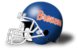
No, they weren't. In fact, Fresno State had some just like it...
 ...and so did Idaho...
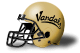
...and New Mexico State...

...and San Jose State...

...and even Boise State.
Still think that logo is special and unique now?
Don't get me wrong -- I still like the script "Pack" helmets, but I'll never mistake them for some grandiose symbol of "the good old days." Besides, do you remember how bad some of those Nevada teams actually were? I don't know about you, but I'm in no hurry to idealize the Tisdel years any more than they deserve.
Ultimately, it's possible to have a healthy appreciation for the past without distorting it into something it never was in the first place. We're not cave men and not all changes are things to be terrified of. At least let some time pass before you immediately decide you hate something like the new Mountain West logo, and resist that urge to trundle on over to the comments section of the next article you read and spew whatever bile you feel compelled to share with the world.
Unless, of course, it's this one.
2 comments:
It's the internet...where snarky negativism is mistaken for wit. Throw in the fact that nobody will click on a link that says "MWC has a nice new logo" like they will for a link that says "New MWC logo a disaster!!1!".
But it's a fricking logo. Why is this so important? As for those saying they hate it without declaring why; it's just a subjective choice. I think anyone that would take Kim Kardashian over Kelly Brook is insane...but I don't need an explanation of their reasoning. It's just a personal preference.
And I like the Pack script logo as much as the current one, but at some point we need to get a logo and stay with it...even if the Top Hat Wolf and Block N w/Wolf are far superior to the current one.
you're right, of course. and as Patrick H said above, its just a logo. But is an overreaction to the new logo really all that surprising?
There are things I don't like about the old logo, and don't mind them getting the idea to create a new one. But it was an opportunity for the MWC to come up with a new logo that embodied the future of the conference, and the one they chose just seemed to fall short of that. They went with a logo that was 3D and futuristic, and I think that kind of moves away from what college football is really about.
But is that all that big a deal? nah, not really. We'll all grow used to the new logo in time. Overreacting on the internet though does not seem to me like its that big a deal either. As for the wolfpack logo, truth be told I like all four. I'm also with you on the script, it just seems too basic and tried before. Their newer three logos all are individual and define Nevada for me whenever I see them.
Maybe that is why I am not a fan of the new MWC logo, it just doesn't seem like they were trying to be trendsetters, and instead were just going for a "corporate" fitting in with everyone else look. But in its own way, I guess that is defensible.
Post a Comment